Concept project, not commissioned
Tidewatch
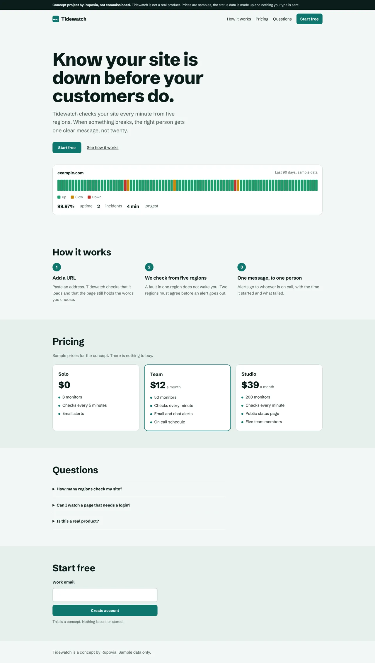
Concept project, not commissioned. A marketing site for an imaginary uptime monitoring product, built to show how light a SaaS page can be.

What this is
Tidewatch is not a real product. We made it to answer one question: how small can a SaaS marketing page be before it stops being a good page? There is no signup, no tracking and no data. The page says so at the top, and the status chart is sample data.
Numbers we measured
- Total transfer, 4 requests
- 52 kB
- Lighthouse, mobile run
- JavaScript, gzipped
- 0.25 kB
- One small script for the form
- Lighthouse, mobile and desktop
- 100 / 100
- Layout shift 0, blocking time 0
- axe violations
- 0
- axe-core, light and dark, 390 and 1440 px
Most of the 52 kB is one font file (47 kB). The HTML is 2.1 kB and the CSS is 1.8 kB after compression.
How the status chart works
The 90 bars are plain HTML, written when the page is built. They are not drawn by a script, so they are there on the first paint and cannot shift the layout. A screen reader does not read 90 separate bars. It reads one sentence: the period, the uptime and the number of incidents.
Decisions
Font
- The choice
- One self hosted variable font, loaded from our own server.
- What we rejected
- A font service on another domain.
- Why
- No extra connection to open, and the page works the same in every country. The cost is the 47 kB file, which is most of the page.
Script
- The choice
- No framework. One small script for the form.
- What we rejected
- A component framework for the page.
- Why
- The page has almost nothing that changes. A framework would add more code than the page has content.
Pricing
- The choice
- Three sample prices, with the middle plan marked.
- What we rejected
- A table with every feature on every plan.
- Why
- A visitor chooses by monitors and check speed. Those are the only differences we list.
Also covered
- Light and dark themes that follow the visitor’s device setting.
- Text and controls that stay readable and reachable on a 390 px phone with no sideways scroll.
- A clear notice at the top that the product is a concept and nothing is sent or stored.